This section documents a test conducted while XUDP's congestion avoidance and retransmission algorithms were still in their infancy.
The test utilized the simple data streaming application described in chapter 6, sending 1MB of data as a continuous stream of 10,240 byte RELIABLE parcels. Table 8.1 lists the statistical results.
| Measurement | Result |
| Total Data Acknowledged | 516.100 KBytes |
| Total Transmission Time | 54.215 seconds |
| Network Bandwidth Utilization | 9.520 KBytes/second |
| Average Round Trip Time | 103.6 milliseconds |
| Average Window Size | 3.9 packets |
The total data acknowledged for this connection was 516.1KBytes only due to a timeout that had been set to end the transfer after almost a minute; witness that the total transmission time is 54 seconds. As should be evident by now, these results indicate a truly shoddy performance, with a round trip time of over 100ms and an average bandwidth utilization of 9.5KBytes/second. In fact, this session used under 1% of the total available 10Mbps bandwidth.
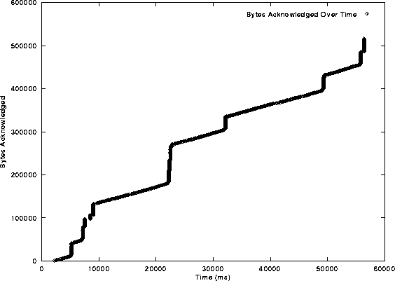
Figure 8.1 shows a plot of the total bytes of data acknowledged versus time in milliseconds. If this graph were representative of a perfect transfer, it would consist of a solid line that begins at the origin and extends to the top, right hand corner with a decidedly shorter time axis. This particular graph is obviously departing a lot from the ideal case.
To understand this graph, consider a case where a file transfer only totals three bytes in length. If the first byte is acknowledged at t=1ms, the second byte, for a total of two, at t=2ms and the third, for a total of three, at t=3ms, the graph would consists of three points tracing out a diagonal straight line as the previous paragraph explained.
Interestingly, on this type of graph, the instantaneous bandwidth utilization can be determined as the derivative; the average bandwidth over a given unit of time can be found from the slope. More vertical slopes correspond to higher bandwidth utilization.
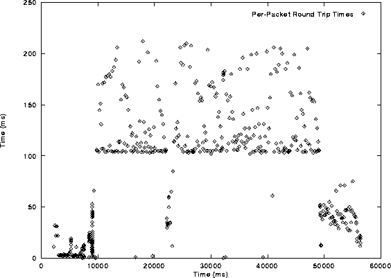
To understand the jagged nature of figure 8.1 we need to look toward the next graph of round trip times, figure 8.2.
The round trip time graph has time on both axes. Each point on the graph is the time between a packet leaving the sending side and the reception of an acknowledgment for that packet at the sending side on the Y axis and the approximate time (quantized to 20ms) that it took the packet's acknowledgment to arrive from the beginning of the entire session shown on the X axis. The ideal graph here is a flat distribution of points as close to the bottom (X axis) as possible, indicating similar and low round trip times for all the packets. For example, if a packet's acknowledgment arrived at the sender 100ms from the start of the connection and the round trip time for the packet was 10ms, the packet would be plotted as a dot at (100ms, 10ms).
Figure 8.2 shows a surprising plateau at approximately 100ms, an extremely high RTT for 10Mbps Ethernet. After much searching, the culprit was determined to be a faulty ``Nagle'' (in this case a delayed acknowledgment) algorithm. In the Transmission Control Protocol, to avoid sending small amounts of data, the protocol would store the data and try to clump additional pieces of outgoing data onto it until a maximum-sized packet was formed; if an acknowledgment for something is received, the algorithm transmitted all of the stored data. Earlier versions of this algorithm utilized a fixed time delay for clumping data together, if the time expired, the data was sent. In the case of XUDP's algorithm, it implemented a fixed, 100ms delay. Packet and parcel acknowledgments would build up in the queues and only get sent every 100ms, accounting for the slightly greater than 100ms round trip time. This algorithm was subsequently removed from the implementation.
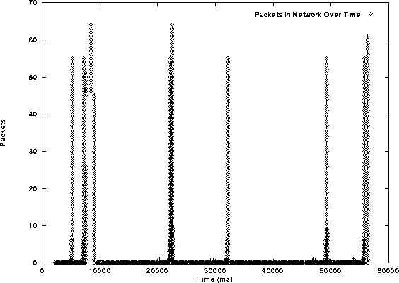
The final graph, figure 8.3, is interesting at best, and shows the extreme flaws in this version of the XUDP server. Plotted here are the number of packets in the network, versus time, as predicted by the size of the congestion window. This graph, if perfect, would show a gently sloping line up to a maximum, where it would stay unless congestion avoidance kicks in. What the graph of figure 8.3 shows indicates that the network is getting filled in quick bursts, followed by long periods of time when only one packet exists in the network. This is far from optimal.